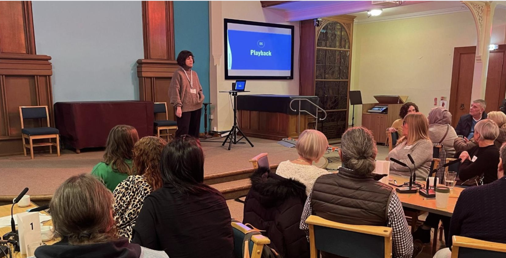
Picture the scene: it’s a rainy Tuesday afternoon and a project team is on a Teams call, excitedly presenting their data-driven approach. But the audience is off-camera. Everybody’s ‘on mute’ (except that one person who’s forgotten and is rustling in the background). The virtual tumbleweed continues to roll until the meeting ends...
So, what can we do to change this scenario?
As a content designer, I was a little nervous when first stepping into a project which was all about data in the home buying and selling process. This wasn’t ‘in my wheelhouse’, so to speak. But what I am good at is understanding users, their needs and putting things across in a way which is clear and easy to understand.
This project became the chance to work with some fantastic specialist data colleagues, allowing us to combine the worlds of data and content design in impactful ways. The following insights share how I think we banished the tumbleweed and what I learned…
Start with the human story
Firstly, people care about people. So we re-structured our approach to telling stories in the project – with a beginning, middle and end. We started by setting the scene with quotes from our user research. These quotes help to bring to life the problems we were trying to solve.
We started with people’s real-life experiences of buying and selling homes. This isn’t an ordinary transaction, it’s a milestone. A life event. Perhaps someone’s buying their first home, moving in with a partner or maybe starting a family. Building understanding and empathy for our users was key. Did you know that buying a home is ranked as one of the seventh most stressful life events?
We made use of data we gathered during our user research. For example, we added extra context for each user quote, such as the region the person was from and the participants' age, to resonate with our audience. We took the numerical, or more quantitative data we’d gathered to help give a snapshot of that user’s journey. Things like the number of years they’d told us they’d been saving for a deposit. Or, the number of offers they’d had rejected. We also used descriptive, qualitative data. For example, incorporating short, colourful quotes from the real people we’d spoken to in our presentations, to help these to life.
Don’t give people the opportunity to switch off
As a content designer, I can pretty confidently say if people don’t understand something they won’t engage with it. Often, people are left feeling like something ‘isn’t for them’. This is usually when people give up listening to a presentation, turn their camera off, and start responding to emails...
One of the easiest ways to stop this happening is through our choice of language. With this in mind, we framed discussions around data sets by starting with user outcomes. In other words, what goal the user is looking to achieve, before then talking about the data ecosystem which underpins this.
Where we had to use more specific words and phrases, we made sure we defined these right at the start. For example, our project involved discussions around open data, so we made sure we explained what this phrase meant early in our presentations, rather than assuming our audience would understand. The same goes for things such as APIs and schemas.
Making data visual
There’s research which shows 65% of the general population are visual learners, meaning they need to see information in order to retain it. Based on this insight, we used graphics and storyboards to make sure our (mostly always remote) audience absorbed our key takeaways in presentations.
I’m a firm believer there’s a Simpsons reference for almost every situation in life. Our team thought about the ‘Troy McClure’ metaphor: how can we get our key messages across in a way which is memorable and personal? You may remember me from engaging presentations such as…
We also made sure slides had clear, punchy headings – so key messages could be seen at a glance. It can be too easy for the most important point on a slide to somehow end up in a small text in the bottom right corner. We also never dropped below a size 12 font for accessibility and readability in presentations.
Using data as a starting point for innovation
An easy trap we could have fallen into when presenting data is leaving the audience thinking, ‘well, so what?’
Opening up data (in other words making it easy and free to use) can inspire innovation – this is a big part of the UK National Data Strategy. There are already some great examples of opening up data across government. For example, you can access and download Energy Performance Certificates (EPCs) and Display Energy Certificates data for buildings in England and Wales.
But, often opening up data can be a long and complex process. So we looked at where users were having the biggest pain points in their house buying and selling journeys and recommended focusing on opening up data for these use cases first. In our context, we also recommended this being the focus for an industry-led pilot. The benefit of things like digital pilots and sandbox testing is they can be used to generate evidence, and pave the way for even bolder ambition and change.
No need for tumbleweed
To resonate with your audience and banish the virtual tumbleweed, you could think about using these insights as content design principles for any data-driven work: starting with compelling human stories to bring your analysis to life, designing language that is clear and inclusive, using visuals to improve understanding, and always positioning data as the potential for innovation and showing what might be possible.
As well as seeing more virtual hands being raised in your next show and tell, how might you apply data with content design to support your own work?
Our recent design blog posts
Transformation is for everyone. We love sharing our thoughts, approaches, learning and research all gained from the work we do.
-

-

What good design documentation looks like
Read blog post -

-

Naming services in complex situations
Read blog post
