When work involves shifting priorities, political sensitivities and stakeholders at different organisational levels, you need visualisations that can flex and adapt.
We've previously written about visualising whole service areas for Defra and how that fits into Defra group's wider transformation. The question people asked us most often was: "How can we do this in our organisation?"
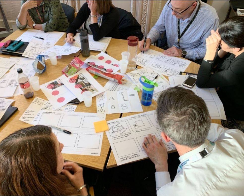
In response to this, we have created a canvas to help any teams create living, modular visualisations. You can access the 'Map different' canvas here – this post explains what the toolkit prompts you to consider and how to get the most from it.
A toolkit for complex stakeholder environments
Before you start, the canvas picks up at the point where you know what you are visualising and people roughly agree on it. Working with Defra group, this took us months of stakeholder interviews and research, and a fair amount of work bringing people to a shared view. That part is slow, and a visual cannot shortcut the work required to do this work well.
What is this for, and who for?
Start with purpose. What problem could a visual solve, and how would it be used?
Then think about who your audience is and what level of detail they need. Understanding that senior leaders at Defra needed information to make strategic decisions rather than operational detail turned our visual into an ecosystem view rather than a set of journeys.
You will usually have a primary audience, but rarely only one. We designed for senior leaders first, while thinking about how others across Defra group would come to the visual and what they would need from it.
You should also consider political sensitivities: what dynamics, attitudes or values do you need to be aware of?
What are you actually showing?
List the things that will appear on the visual, for example, services, teams, users, stages, or decisions. Group them together to find your visual vocabulary.
Then choose the relationship that matters most. Things can nest, connect, follow an order, overlap, or sit at different zoom levels. Lead with one, and be deliberate about any others you layer on top. Our map leads with overlap, showing whole services as regions that border one another, but it also carries connection: the roads work as boundaries between regions and as links across them at the same time.
We started with Venn diagrams because they are simple, universally understood, and honest about being a simplification. Getting to that skeleton structure first is what made room for the detail later.
Can you use a metaphor?
A metaphor turns something abstract into a picture people already recognise. What we ended up with was an island, with whole services as its regions.
Other examples of metaphors might include:
-
an iceberg to represent what you can see of a problem on the surface vs the extent of a problem you don't see under the surface
-
river and tributaries to show how separate streams (teams, inputs, funding) flow together into one current
How will your visuals adapt to change?
Organisations reorganise and teams get renamed. Ask which parts of your visual can be separated, and how layers could have different details for different audiences.
You should also consider how your visual might be adapted for different formats. Our Defra map was originally designed to be printed. However people also wanted it in slide decks, and because we had built it in separable pieces, we could pull out individual whole services.
How will you test it?
Who will you test it with, and how will you collect feedback? For the Defra work, testing changed the output. We renamed whole services to match users' language, merged some and moved others.
How will you make it accessible?
Think about how people with visual impairments, motor impairments, and those who struggle to take in complex visual information will engage with your visual. You should consider things like:
-
text size
-
colour contrast
-
cognitive load
-
Creating a full text description that stands alone
Access the 'Map different' visual storytelling canvas
Download a text version of the canvas
How have you applied our 'map different' approach?
Get in touch
More from our design blog
Transformation is for everyone. We love sharing our thoughts, approaches, learning and research all gained from the work we do.
-

How AI agents will change the role of your website
Read blog post -

Thinking in pictures with visual facilitation
Read blog post -

Taming the prototype monster
Read blog post -

The power of research in politically complex systems
Read blog post
